
Video tutorials for Repeat Signage
The best way to get started is to use the video tutorials available at our website that will very quickly get you started with Repeat Signage. Visit www.repeatsoftware.com/Training.aspx to access these.
Main Repeat Signage designer screen
The appearance on the main designer screen will be different depending on whether you are in full screen design mode or designing a presentation for a screen with a different resolution (number of pixels). The designer screen is full screen so that you have absolute control over every pixel on a display monitor. This hides the Windows start bar. If you need to use another program, then either use the Alt+Tab keyboard combination, or press the Windows key (the flag key) on your keyboard to bring up the menu.
Repeat Signage uses the term 'control' to mean any object on the designer screen. These controls can be pictures, videos, PDF files, text, etc, i.e. any of the support files that can be displayed.
Please note that some options are not available in the Standalone Edition of the software, and only In the Standard and above editions.
How to:
Tutorial video on using the designer screen
Designer screen - Basic use of the presentation designer screen
Designer screen - Move, resize and delete controls
Moving, resizing and deleting controls in the Repeat Signage Designer
Setting a presentation background colour or pictures
Shaping controls in Repeat Signage
Z ordering controls (stack order of controls) in the Repeat Signage Designer
Add controls to the screen to display pictures, videos, PDF files, etc
On the menu panel, click on 'Insert' then insert any of the following controls:
Animated gif control
Audio control
Clock (text based) or date control
Round clock control
Controller - Allows other control's play lists to be synced
Banner control
RSS control
PDF/Document control
Picture control
PowerPoint presentation scheduler control (Standard and above editions only)
RTF document control (Standard and above editions only)
Shape control
Spreadsheet control
Text label control
Text block control
Video control (Standard and above editions only)
Web browser (and web widgets) control
Webcam control (Standard and above editions only)
The Insert dialog screen will be shown. You can use F1 on this screen to get help on any options you may not understand.
Move controls around the screen
The easiest way to move a control is to click and hold the left mouse button on a control and then drag it to a new location and then release the mouse button. You can also use the menu panel by changing the values in 'Position on screen' to the required location.
Resize controls
Click on a control you wish to resize. You will see that it gets a border with 're-sizer' handles (buttons) in each corner. Click on one of these re-sizer handles and hold down your left mouse button, and then move your mouse to resize. When you are happy, then release the left mouse button.
On the menu, there is a 'Keep aspect ratio' combo box. This can be changed from NONE to MEDIA, 4:3, 1:1, etc. The aspect ratio is the shape of the original item. For example, a picture may be 400x300 pixels in size, i.e. it has a 4:3 aspect ratio. If you resize the picture with the 'Keep aspect ratio' box set to MEDIA to a width of 800 pixels the height is automatically changed to 600 pixels, which keeps the same shape. A 1:1 aspect ratio is a square shape and 16:9 is the shape of widescreen televisions.
You can also change the size on the menu by change values in the 'Size in pixels' section. Also, there is a 'Size' menu. You can use this to quickly make objects full or half the screen size.
Duplicate controls
Right mouse click a control to bring up it's context menu. You can then select 'Duplicate' to make another exact copy of a control. If a control uses a playlist, then the playlists will also be copied. Once duplicated, there is no link between the duplicate and the original, so you can change them independently.
You call also use 'Edit' then 'Duplicate' on the menu.
Delete controls
There are 3 ways to delete a control. Click on a control to highlight it. Then either:
- Press the 'Delete' key on your keyboard
- Right mouse click the control and select 'Delete'
- On the menu you can select 'Edit' then 'Delete'
Display or change a control's properties
When you click on a control, the menu displays 'Selected item properties'. These are displayed for all controls are:
Name - A friendly name for the control if you have given it one. By default, the first picture control put on screen is PICTURE01, then next PICTURE02, etc. You may want to name these if you have a lot of pictures and want to be able to select a control quickly from the 'Content items on screen' list at the bottom half of the menu.
Position on screen - The control's location on screen in pixels. 0,0 is top left of the screen.
Size in pixels - The current size of the control in pixels.
Keep aspect ratio - 'Aspect ratio' is a term used to describe the shape. A square has a 1:1 aspect ratio. If a square shape was 100 pixels wide the height would be 100 pixels because of the 1:1 width to height ratio. Another example is computer monitors and television screens. On non-widescreen monitors and televisions the aspect ratio is 4:3 meaning if the monitor had a width of 4ft then the height would be 3ft. Widescreen televisions has an aspect ratio of 16:9.
Keep aspect ratio is used to keep the shape of a control as you resize it to make it bigger or smaller. For example, you may insert a picture control showing a picture of a ball with the picture being made up of 800x600 pixels. 800x600 pixels is a 4:3 aspect ratio. If you change the keep aspect ratio to NONE, then you can resize the picture to say 800x200 pixels which will stretch the image so that you get a swashed ball shape. Changing the keep aspect ratio to MEDIA will make it that when you resize the image, it will stay the same shape. So that if you change the width to say 400 pixels, the height will automatically adjust to 300 pixels keeping the shape.
Shape - All controls are Rectangles by default, but you can use this drop down to change a control's shape to circle, triangle, etc.
Fade (see through) - All controls are 100% solid by default, i.e. have a fade value of 0. You can change this value from 0 to 99. A fade of 50% will allow you to see any controls under the selected control and give a ghost type effect. You can changes a control's z-order by right mouse clicking a control and then using "bring to front", "send to back", "bring forwards" and "send backwards".
You can change the above settings directly on the menu. In order to edit the advanced properties, then either:
- Click on the 'Edit properties' button on the menu
- Double click a control
- Click then right mouse click a control and select 'Edit properties'
Change a control's z-order (send-to-front, bring-to-back, send-backwards, bring-forwards)
Click on a control to highlight it and the right mouse click and select either:
'Bring to front'
'Send to back'
'Bring forwards'
'Send backwards'
Use a play list with a control
Playlist example
You can use play list with most types of controls. The example below is for a play list of picture files, but the process is the same for scrolling any type of control:
1. On the designer screen menu, click on 'Insert' then 'Insert picture'. This will allow you to choose a Picture file. This defaults to 'On local or network drive'.
2. Click on the browse button and choose a picture file and then click on 'Open' to return to the previous screen.
3. Now click on OK to insert the new picture control onto the designer. You can then position and size your Picture control as required.
4. Double click the Picture control to view the picture control's properties.
5. Put a tick in the 'Use play list instead' tick box. This will take you to the Playlist tab. Your first Picture appears in the grid for you.
6. Use the 'Add' button to add other Pictures to the list.
NOTE - You could also use 'Add blank' to add blank items which can be used to give a pause between playing your picture files. For example, you could insert a single picture file and set it to display for 2 seconds. Then insert a blank item again for 2 seconds. This would then give the effect of flashing the picture on and off the screen.
7. When you have added your play list pictures, then click on the OK to close the properties screen and return to the designer. Your play list will start playing immediately. The length of time each one will display for will depend on how long you specified for each play list item.
Scroll a control (simple)

Simple scrolling example
(IMPORTANT NOTE - The scrolling examples above use animated gifs to give you an idea of different scroll types. Scrolling in the actual software is smooth and not jerky)
You can scroll most types of control. This example is to scroll picture files, but the same process is used for scrolling any type of control:
1. Create a play list of controls - Follow the instructions for 'Use a play list with a control' above so that you already have a picture control with a playlist.
2. Open the picture control's properties by double clicking it and then selecting the 'Scrolling tab'.
3. Change the 'Scroll direction' combo box to an entry other than NONE, for example RIGHT TO LEFT. Click on OK to see it scrolling.
For more scrolling options, on the properties 'Scrolling tab', press the F1 key to see the various options.
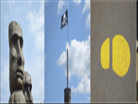
Simple scrolling with pause picture control

(IMPORTANT NOTE - The scrolling examples above use animated gifs to give you an idea of different scroll types. Scrolling in the actual software is smooth and not jerky. There is a pause between the scrolling of images in the above sample.)
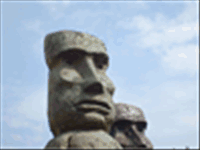
The above picture shows the 'Heads.jpg' and 'PirateFlag.jpg' sample pictures scrolling from right to left. You can also scroll 'left to right', 'top to bottom' and 'bottom to top', plus diagonally. To create this:
1. Create a play list of controls - Follow the instructions for creating a play list above so that you already have a picture control with a playlist. Use the four sample pictures: FootPrint.jpg, Heads.jpg, Penguin.jpg and PirateFlag.jpg.
2. Open the picture control's properties by double clicking it and then selecting the 'Scrolling tab'.
3. Change the 'Scroll direction' combo box to an entry other than NONE, for example BOTTOM TO TOP.
4. Change the 'Pause between items seconds to 2.
5. You will usually want the next time to scroll on quiet quickly between paused items, so change the 'Pixels to move each move time' to 15
6. Click on OK to see it scrolling.
This will scroll very quickly between pictures, but pause for 2 seconds when the picture is completely filling the control. For more scrolling options, on the properties 'Scrolling tab', press the F1 key to see the various options.
Scroll a control (advanced)
Advanced scrolling example with multiple pictures being scrolled across the screen
(IMPORTANT NOTE - The scrolling examples above use animated gifs to give you an idea of different scroll types. Scrolling in the actual software is smooth and not jerky)
You can specify the size of the scrolling items and the size of the control to allow multiple items to be seen on screen at the same time. This is different to the 'Scroll a control (simple)' above as the scrolling items are the same size at the control, so you only see a maximum of two scrolling items at the same item.
To scroll in this way:
1. Follow the instructions for 'Scroll a control (simple)' above.
2. Open the picture control's properties by double clicking it and then make sure you are on the 'Playlist' tab. Add 4 pictures into the playlist, by using the Add button, selecting an image and then the OK to return to the playlist.
3. Click on the 'Scrolling' tab. Take the tick out of the 'Playlist items same size as control' tick box. This will then display the 'Specify play list item size'. Set the Width to 100 and the height to 75.
4. Click on OK to save and return to the designer screen.
5. Now resize the picture control to 300 x 75 pixels. You can do this by clicking once on the picture control to select it and then changing the size on the menu 'Size in pixels' section.
Scheduling the playing of picture files (Standard and above editions only)
The information on creating a play list and scrolling controls above shows you how to create a play list that just loops files. On the play list tab, there is a 'Schedule type' drop down list. You can change this from 'PLAYLIST' to 'HOURLY', 'DAILY', or 'WEEKLY'. These are different to the 'PLAYLIST' option where when you add items you have to specify 'From' and 'To' time values.
For example, an HOURLY scheduler can be used to play a file at the start of every hour for 1 minute (0 minutes 0 seconds to 0 minutes 59 seconds). You have to put in files to cover the entire hour. If you don't want anything playing for the rest of the hour, then insert a blank item that covers from 1 minute 0 seconds to 59 minutes 59 seconds. At the end of an hour, the entire hourly schedule will loop again. When you play a presentation, it displays items based on the current time of day.
When you add a blank item, you can decide whether to make the blank item display the background of the control (which you can specify a colour or picture for) or whether to make the entire control invisible. When adding or editing a blank item, go to the 'Blank item' tab and either tick or un-tick the 'Entire control is visible' box. This is useful for scheduling when you want a control invisible.
The DAILY schedule type allows you to specify files and blank items to cover the entire day. At the end of the day, the schedule will start again. WEEKLY allows you to schedule what happens on each day of the week (at any time), and then restarts at the beginning of the next week. Repeat Signage uses Monday as the first day of the business week. Another thing to note is that every control that supports scheduling runs independently of all others, so you can have lots of different controls all doing different things.
Tools have been added to Repeat Signage to help you test scheduling. On the designer screen menu, you can click on 'View' then 'View program time for schedule testing'. Clicking on this puts the time on the bottom right of the designer screen menu. This is the clock that Repeat Signage uses with controls. You can change this time using 'View' then 'Change program time for schedule testing'. This allows you to change either the time or date, so that you can see what will be displayed at any point. For example, you may have an 'offer of the day' for each day of the week, made by displaying pictures in a picture control. Changing the program date to another day will allow you to test that the correct picture file, with that day's offer on, is being displayed.
Change the control's name in the list
Double click on the control you want to rename to bring up the properties screen. Then click on the 'Additional' tab which is the top right corner of the properties screen (you may need to use the right arrow button in the top right corner to see the 'Additional' tab). Change the 'Control grid description' and click on OK to save it.
Fade a control so that it is see-through
Click on a control to highlight it and then look at the menu. All controls are 100% solid by default, i.e. have a fade value of 0. You can change this value from 0 to 99 and then press your 'Enter' key on your keyboard to update it. A fade of 50% will allow you to see any controls under the selected control and give a ghost type effect. You can changes a control's z-order by right mouse clicking a control and then using "bring to front", "send to back", "bring forwards" and "send backwards".
Change the shape of a control
Click on a control to highlight it. On the menu use the 'Control shape' combo box to change the control's shape from the default 'Rectangle' to 'Circle', 'Triangle', etc. This works for all controls except audio, which is not displayed when playing presentations.
Keeping the shape of a picture (or video) when resized
Click on a picture or video control and look at the menu. On the menu there is a 'Keep aspect ratio' combo box. This can be changed from NONE to MEDIA, 4:3, 1:1, etc. The aspect ratio is the shape of the original item. For example, a picture may be 400x300 pixels in size, i.e. it has a 4:3 aspect ratio. If you resize the picture with the 'Keep aspect ratio' box set to MEDIA to a width of 800 pixels the height is automatically changed to 600 pixels, which keeps the same shape. A 1:1 aspect ratio is a square shape and 16:9 is the shape of widescreen televisions.
Making a control full screen and other sizing options
Click on a control to highlight it and then look at the menu panel. From the menu choose 'Size/position' and then 'Full screen'. This will resize the control to full screen. Alternatively, you can right mouse click the control to bring up a context menu and select 'Size' then 'Full screen' from there instead.
You may need to right mouse click this control afterwards, and use 'Send to back' otherwise it will cover any other controls you have on screen.
Undoing and redoing changes
You can undo any change that happens from this main designer screen including deleting, moving and resizing controls. To undo the last change then on the menu click on 'Edit' then 'Undo'. Alternatively, use the keyword shortcut Ctrl+Z (holding the Ctrl key down and then pressing the Z key). You can undo multiple changes by using undo. You can also redo an undo by using the menu 'Edit' menu 'Redo' or using the keyword shortcut Ctrl+Y.
Undo does not currently undo any changes you make whilst editing a control including making changes to playlists.
Note - Ctrl+Z is standard for undo in most programs including Microsoft Word. In Microsoft Word and other Microsoft Office programs, Ctrl+Y is also used for redo.
Designing presentations - general advice
Please see our Designing presentations page. Also, the most simple presentation designs are usually the best ones. On the menu, click on 'View' then 'View presentation complexity index' to screen a screen that analyses your presentation and offers advice.
Adding a password to a presentation
On the designer screen menu, click on 'File' then 'Settings'. You can enter a password here. When you click on OK it will ask you to confirm the password. Anyone can play this presentation, without the password, but the password is required to open/edit the presentation. You will then need to save the presentation to apply the password to the presentation file. On the designer screen menu, click on 'File' then 'Save'.
Change the background colour of the presentation or using a background image for the presentation
On the designer screen menu, click on 'File' then 'Settings'. Look at the 'Background colour' section. You can use the 'Choose' button to select either a solid or gradient background colour, or put a tick in the 'Use a background image instead of a colour' tick box. You can then use the 'Browse' button to select a picture file. Please make sure that the picture file has a high resolution (number of pixels, such as 1280x1024). Using low resolution pictures will look poor when stretched to cover your entire monitor, or monitors.
Changing the presentation's resolution (number of pixels)
Presentations in Repeat Signage are designed for a specific computer resolution, such as 1024x768, 1280x1024, 1400x900 pixels, etc. This allows pixel for pixel control over how presentations are displayed on your monitor, projector, LCD monitor or plasma screen. To change the number of pixels that your presentation is designed for, then on the designer screen menu, click on 'File' then 'Settings'. Change the number of pixels in the 'Target screen size' section to a new resolution, then click on the 'OK' button. You will receive a warning and confirmation message.
Note - If you change the presentation's resolution to a larger number of pixels, then the current controls on screen will stay in the same place and you will then need to move them as appropriate to make your presentation look correct on the new target resolution. If you change the resolution to a lower number of pixels, then any controls that will not fit into the new number of pixels are moved to the top left corner of the screen. You will then need to move and resize these control as necessary to make your presentation look correct.
View a list of files (pictures, videos, etc) used by your presentation
On the designer screen menu, click on 'View' then 'External files used in your presentation'. This will list all the files used.
You can also view or edit these using the default program that Windows uses to display your files. For example, if you have a picture file (and no graphics software installed) then the 'Edit' button will display your file in Windows Paint. Using the 'View' button will display the picture in Windows Photo View.