
Data grid control
| Supported databases | MS Access, MS SQL Server, ODBC, CSV and XML files |
| Playlist support | Yes |
| Scheduler support | Yes |
| Scrolling support | Yes |
| Editions | Available in Corporate and Media Wall editions |
| Training videos | Repeat Signage Control - Datagrid Control dsplay data in a grid from a database (6.08 min/secs) |
| Repeat Signage Control - Banner Control display images and text from a database (6.46 min/secs) | |
| Repeat Signage Control - Text Label Control display single line of text from a .txt file or a database (6.33 min/secs) | |
Description
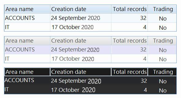
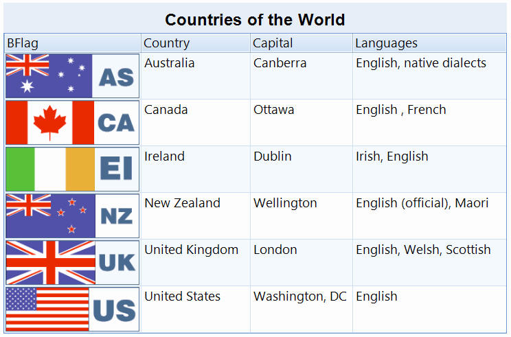
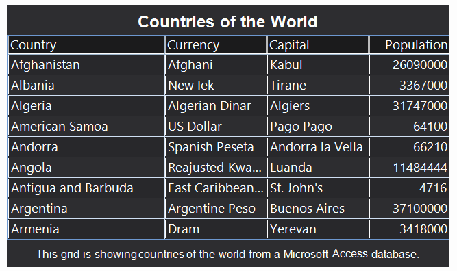
The data grid control allows the displaying of database information in a grid format, such as:
and is designed to be as flexible as possible so that you can fully customise which information to display and exactly have each column in the data grid will be shown on screen.
For example, in the above picture we have a 'Creation date' column. The database field was actually called 'Creation' so we entered the header text of 'Creation date' instead. We have chosen to display the dates in the format '24 September 2020'. We could have chosen to format it as 24/09/2020 (UK date format), 09/24/2020 (US date format) or even applied a different language so it displays the words display in French or Spanish. The 'Total records' column above displays numbers. Again we could format numbers, currency or percentages in a variety of formats.
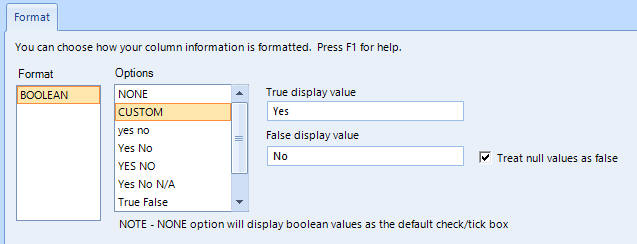
The 'Trading' column in the above picture comes from a Boolean database field where the value is either True or False. We have chosen to display 'Yes' for True and 'No' for false. We could just as easily chosen any other text to display such as 'Affirmative' or 'Negative' instead.
Grouping is added so that information can be split into sections:
A new tab has been added so that you can control what is displayed if either no records returned from a database query, or on no database connection.
Selecting data
The first step in using the data grid is selecting the data you want to display. When you insert a data grid control into your presentation, you will see the 'Select data' panel which allows you to connect to a database and then select data:
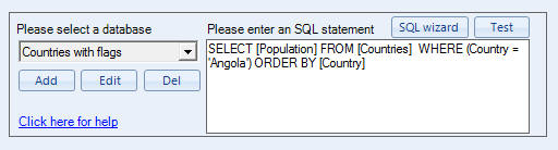
Essentially, you use the 'Add' button to add a connection to a database such as a Microsoft Access database. When you have set up a connection then you can use the 'SQL wizard' button to look at the database and it helps you select the data you want. It then returns an SQL statement which is an IT industry standard programming language used to collect data from databases.
The wizard will do the work for you, so you don't need to write SQL statements yourself and if you need any help then feel free to email our support people, who will be happy to help. See Repeat SQL Selection.
Once you have selected your data then you will be able to use the other tabs on this screen to further define how your selected data is to be displayed. Email support@repeatsoftware.com if you need any help.
Data grid columns tab
After you have selected your data to display then choose the 'Columns' tab. A list of columns (or fields) from your database is displayed in a list here:
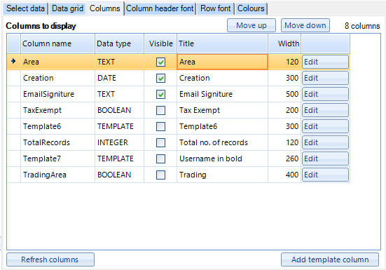
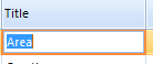
The grid shows you the data type of each column and allows you to use the tick boxes on the Visible column to tick whether to display each column or not. You can also click in the Title names such as the 'Area' column name in the above example:
and just type in a new column header. The same can be done with the width column:

so that you can set individual widths for each column.
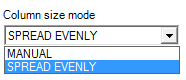
Note - If on the 'Data grid' tab you have selected anything other than MANUAL in the 'Column size mode' drop down list, then you wont be able to edit column widths:
There is also an edit button next to each of your columns in the list:

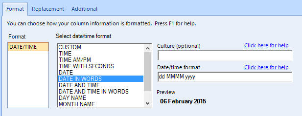
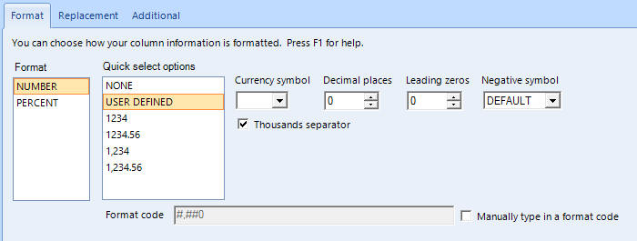
You can use this to format the column. The editing screen that appears is different depending of the data type of your column. For example, if you column is TEXT then you will get an editing screen with text formatting options. If a DATE/TIME column, then you will be able to choose how to display your date, time or date/time information. TEMPLATE columns have a different screen altogether. You can use the help pages on the screens that appear to get more information on your options.
Column order - The top row will be the first column in your data grid. You can use the 'Move up' and 'Move down' buttons to reorder them as you see fit.
Template columns - There is an 'Add template column' button to add a new template column to your grid. This allows you to build up a custom template to display field information from any fields in your records. See the Template columns help page.
Column data formatting
There are many different types of data fields in a database table. For example, text fields, number fields, date/time fields and boolean fields. For example, if you click on the 'Edit' button next to a TEXT column, you will see a screen like:
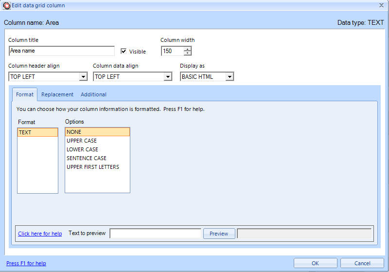
This gives you a load of standard field options like 'Column width', 'Column header align', etc, plus options specific to text like the ability to make the text upper or lower case. The formatting box is different again for date/time columns:
Numeric columns:
and boolean columns:
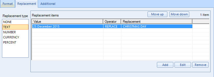
You will also notice that there are 'Replacement' and 'Additional' tabs on some of these images above. Replacement can be used to change information, for example, the date field below replaces '25 December 2015' with 'CHRISTMAS DAY':
and the Additional tab:
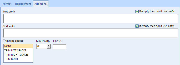
allows other options like prefixes and suffixes so that you can format your data into sentences if needed.
Binary columns
Some database have binary fields which allow the contents of files to be stored in them. This is commonly used to store image files. Repeat Signage will automatically try to display binary columns as pictures. For example:
Data grid general options
There are a number of different display options on the 'Data grid' tab:
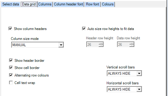
which are described on the Data grid tab help page.
Colours and fonts
You can set fonts and colours for each element in the data grid with the 'Column header font', 'Row font' and 'Colours' tabs.
Refreshing the data grid to get the latest data
Use the Refresh tab for this:
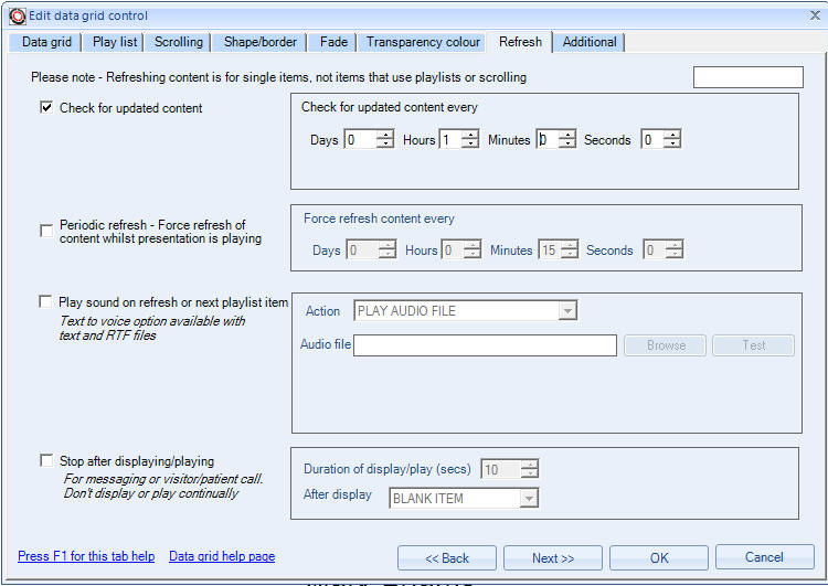
The 'Check for updated content' option allows you to check for changed information periodically. In the above picture, we are checking for new data once an hour. With file based databases, such as Microsoft Access databases, CSV or XML files, then if the file date hasn't changed the data grid is not updated. With database servers, such as Microsoft SQL Server, the entire data grid would be refreshed every hour.
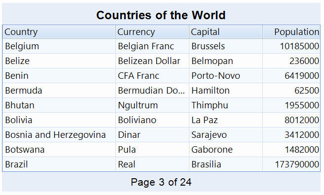
Paging
Depending on how big you have sized your data grid and the heights of columns, etc, the data grid control will show you a number of records in one go, for example 20. If you data base information has more than this number of records, for example 100, then you are not going to be able to see all the records in one go. This is where paging comes in. When you enable paging, the data grid control will split you total records into a number of pages. So for a 20 row data grid with 100 records, you will end up with 5 pages. With paging enabled the data grid control will display the 1st page, then will transition to the 2nd page after a set number of seconds, which can be set on this tab. When it get to the last page then page 1 will automatically be displayed next.
Below is a grid with paging enabled. The paging panel is displayed at the bottom and the default text is 'Page X of X'. The paging area can be fully customised with font, size, colours, text alignment, etc:
Header and footer panels
You can optionally display a header panel above your data grid to display a title and also optionally put a footer panel below your data grid to display additional text there. You can enable these on the 'Header' and 'Footer' tabs. You can always insert your data grid into a presentation and then use our other controls, such as the Picture control, Text block control, Shape control, and Text label controls to build up a customised surround to your data grid.
This grid shows a grid with a header and footer:
Grouping
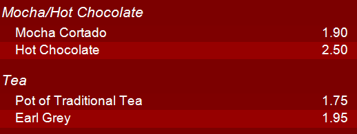
You can also group records together, for example:
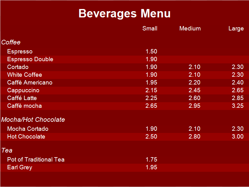
In the above example, a database has a 'SubCategory' field for each record which contains 'COFFEE', 'MOCHA/HOT CHOCOLATE' or 'TEA'. By enabled grouping and grouping on this field, the data grid will separate these into sections automatically. You have full control over how header of each section is display including font, colour, background, height, etc.
Preset colours
There are a number of colour scheme presets on the 'Data grid' tab. If you use the 'USER SETTINGS' combo, there are few predefined colour schemes for the data grid control:
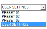
These are PRESET 01, PRESET 02 and PRESET 03 colour schemes:
No records returned and no database connection messages
See Data grid no data options tab help page.
Support
Please email support@repeatsoftware.com if you need any help with displaying your data in the data grid control.